
We are all aware that the climate state of the Earth is changing as quicker as ever to higher average temperatures, contributing to all sort of disasters such as ice melting in the poles with consequent increse in the sea levels, droughts and floodings, weaher anomalies etc.
One of the impelling questions is: how can we assess the increase in the average temperature with respect to the past, and demonstrate that the climate of our Earth is changing?
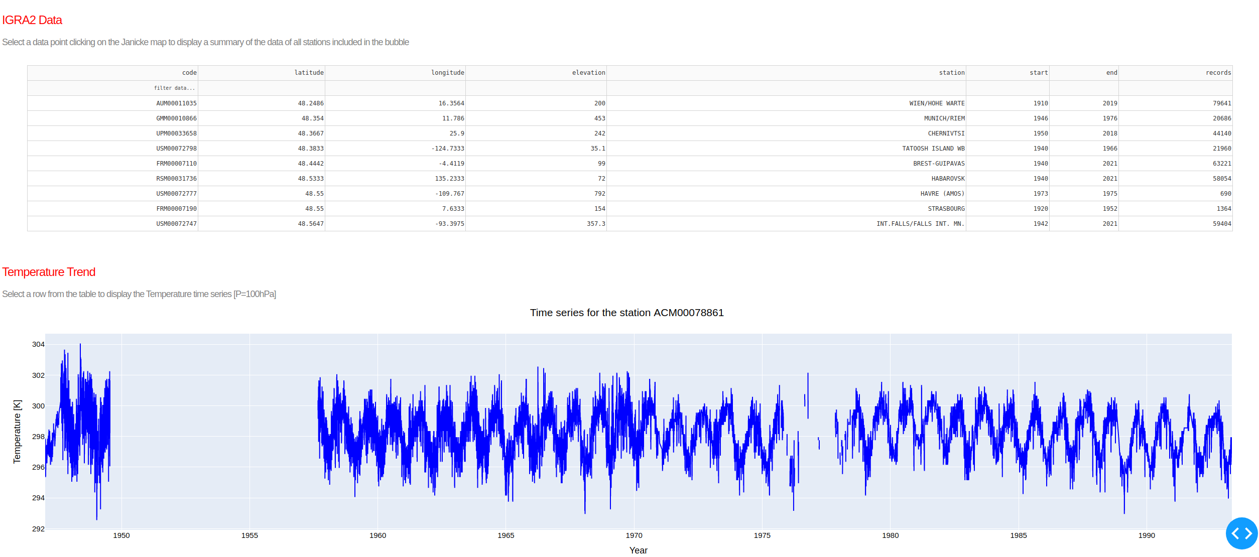
The answer comes from weather and meteorological observations recorded in time series.
One of the most common and spread instruments for weather observations are radiosondes. These instruments are essentially composed of two parts. The first is a balloon flled with helium that carries the second component, i.e. the real radiosonde. Radiosondes are small, light and cheap instruments with different sensors able to measure e.g. temperature, air humidity, wind direction and wind speed during their ascent after the balloon is released.
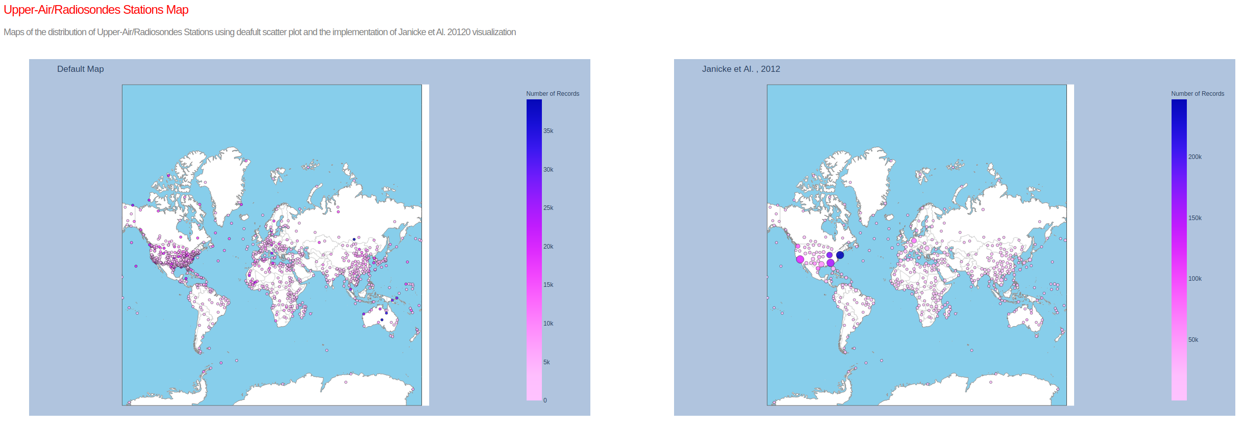
The number, location and number of measurement (records) collected in the archive change considerably in time. It is then useful to visualize the distributions of stations, active in a certain data range, in an interactive Visualization Tool .
Building upon the technique developeb by Janicke et Al. (2012) in the article COMPARATIVE VISUALIZATION OF GEOSPATIAL-TEMPORAL DATA , the here presented Visualization Tool includes the following features:
The Visualization Tool is completely written in python, and uses standard libraries (numpy, scipy, pandas, plotly, dash). Please refear to the README in the GitHub for technical details.
Resources